Form Design · 17 November 2026 · 10 min read
Best Demo Pages for SaaS Companies: 4 Real Examples
Explore four real SaaS demo pages with screenshots from Ramp, Gong, Asana and Notion. Learn what makes a great demo page and how to improve your own.
The best demo pages for SaaS companies make the next step worth taking. They explain what the buyer will see, ask for information that has a clear purpose, provide relevant proof, and make it obvious what happens after the form. Ramp, Gong, Asana and Notion each offer a useful example, but for different reasons.
A buyer arrives with a practical question: is this product worth a closer look? Too many demo pages answer with a phone-number field and a button that says Submit. That is a request for effort, not a reason to book.
Below are four real SaaS demo and sales-contact pages, with screenshots and specific lessons you can borrow. You will also find a demo-page checklist, suggested form questions, and a way to measure whether your changes produce better conversations rather than just more submissions.
How we reviewed these examples: we inspected the public pages and captured desktop screenshots on 17 November 2026. These are editorial examples of useful design choices, not a conversion-rate ranking. We did not submit the forms, test their later steps, or access the companies' analytics. Pages may vary by location, device or experiment. Screenshots are reproduced for commentary; the respective companies own their brands and page designs.
Which SaaS demo pages are worth studying?
Start with Ramp for different ways to explore a product, Gong for a clear commercial outcome, Asana for setting follow-up expectations, and Notion for a focused first form step. None is a template to copy without considering your audience.
| Company | Standout choice | What to borrow | Trade-off to consider |
|---|---|---|---|
| Ramp | Live demo, interactive tour and videos | Match the next step to buyer readiness | Multiple options need a clear hierarchy |
| Gong | Revenue-focused headline and a work-email starting point | Connect the meeting to an outcome | Explain the meeting format as well as the product |
| Asana | Specific topics and a response-time promise | Remove uncertainty about sales follow-up | A longer form asks for more commitment |
| Notion | One visible work-email field before Next | Give the first step a single job | Less familiar products may need more explanation |
1. Ramp: let buyers choose how they want to explore
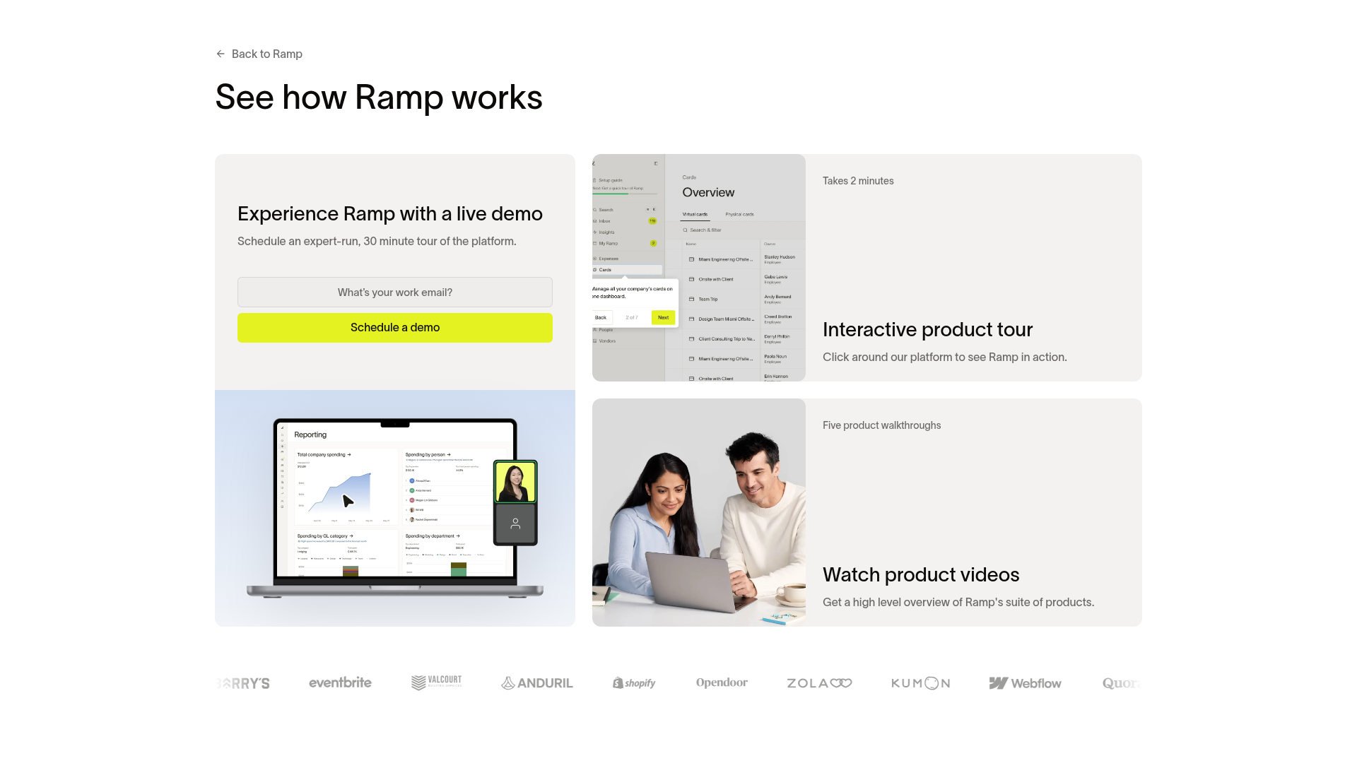
Ramp does something many SaaS demo pages miss: it recognises that wanting to see a product is not always the same as wanting a sales call.
The captured page offers an expert-run, 30-minute live demo, an interactive product tour labelled as taking two minutes, and product videos. A finance leader preparing a buying decision can request a conversation. Someone checking whether the interface makes sense can explore first.
What works: the choices describe different levels of commitment. The live option gives a duration. The self-guided routes offer a useful next step without making every visitor take the same path.
What to borrow: keep a primary demo CTA, then give earlier-stage buyers one clearly labelled alternative. A short walkthrough of a real task is more useful than a generic brand video.
What to watch: choice can become clutter. If you add a tour, videos, a trial and a meeting link, make the differences easy to understand. Check that each route works on mobile rather than assuming a desktop product tour will suit every visitor.
2. Gong: make the outcome more interesting than the form
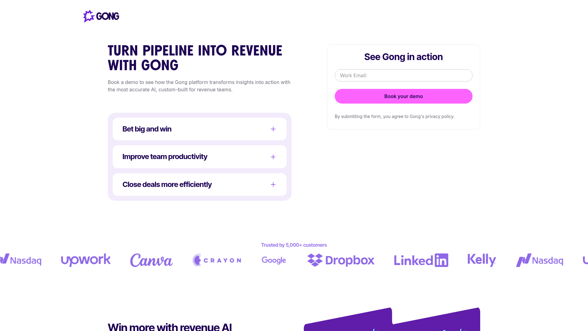
Gong leads with a commercial result: turning pipeline into revenue. That is more relevant to its audience than an invitation to see a list of software features.
Three supporting sections cover strategic initiatives, team productivity and closing deals more efficiently. The demo form sits beside that context, with a work-email field and a booking CTA in the captured first view. Customer logos appear below.
What works: the page gives a revenue leader reasons to care before asking them to act. The form is prominent, but it is not left to do all the persuasion on its own.
What to borrow: write the headline around a problem the buyer already recognises. Then name two or three things the demonstration will help them evaluate. Use proof that is relevant to that buyer, not just the largest collection of logos you can fit.
What to watch: one visible field does not establish that the whole booking journey has one field. We did not submit it. On your own page, be equally careful to explain whether the next action starts a request, opens a calendar, or provides immediate access.
3. Asana: tell people what sales will do next
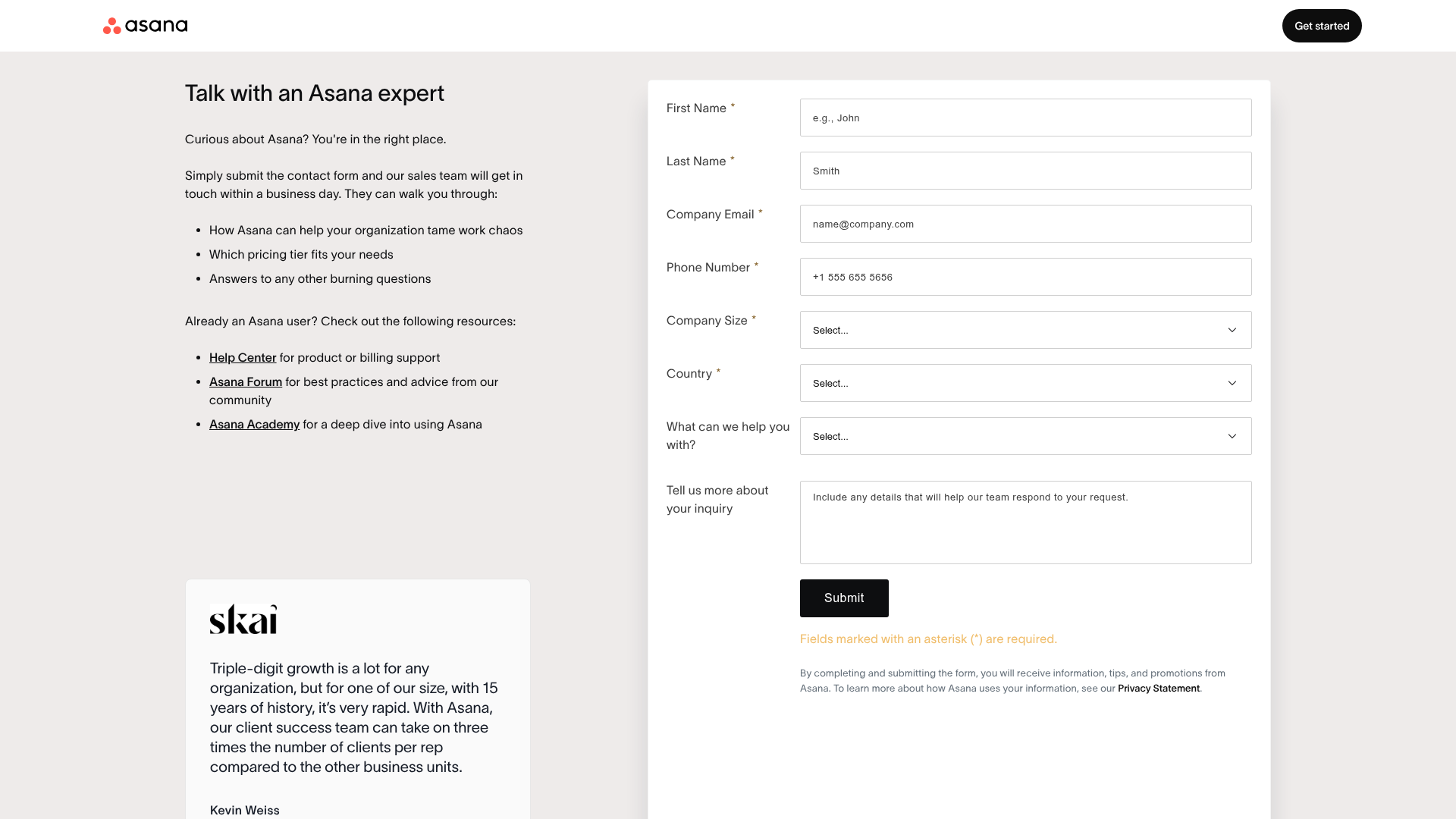
Asana's sales-contact page is a useful example of a demo-adjacent experience. It offers a conversation with an expert rather than presenting an instant product demo.
The copy says the sales team will get in touch within a business day. It also explains what they can discuss, including how Asana could help the organisation and which pricing tier may fit. Existing customers get separate links to support and learning resources.
What works: the page answers the question that vague confirmation messages leave open: what happens after I submit? Separating existing-customer help from sales enquiries also gives visitors a more relevant route.
What to borrow: put a realistic response promise next to the form. Tell people who will respond and what that person can help with. Only promise a timeframe your team can consistently meet.
What to watch: the visible form requests several details, including a required phone number, company size and country. Those fields may support Asana's sales process, but that does not mean your team needs them all. Ask what decision each required answer changes.
4. Notion: give the first step one clear job
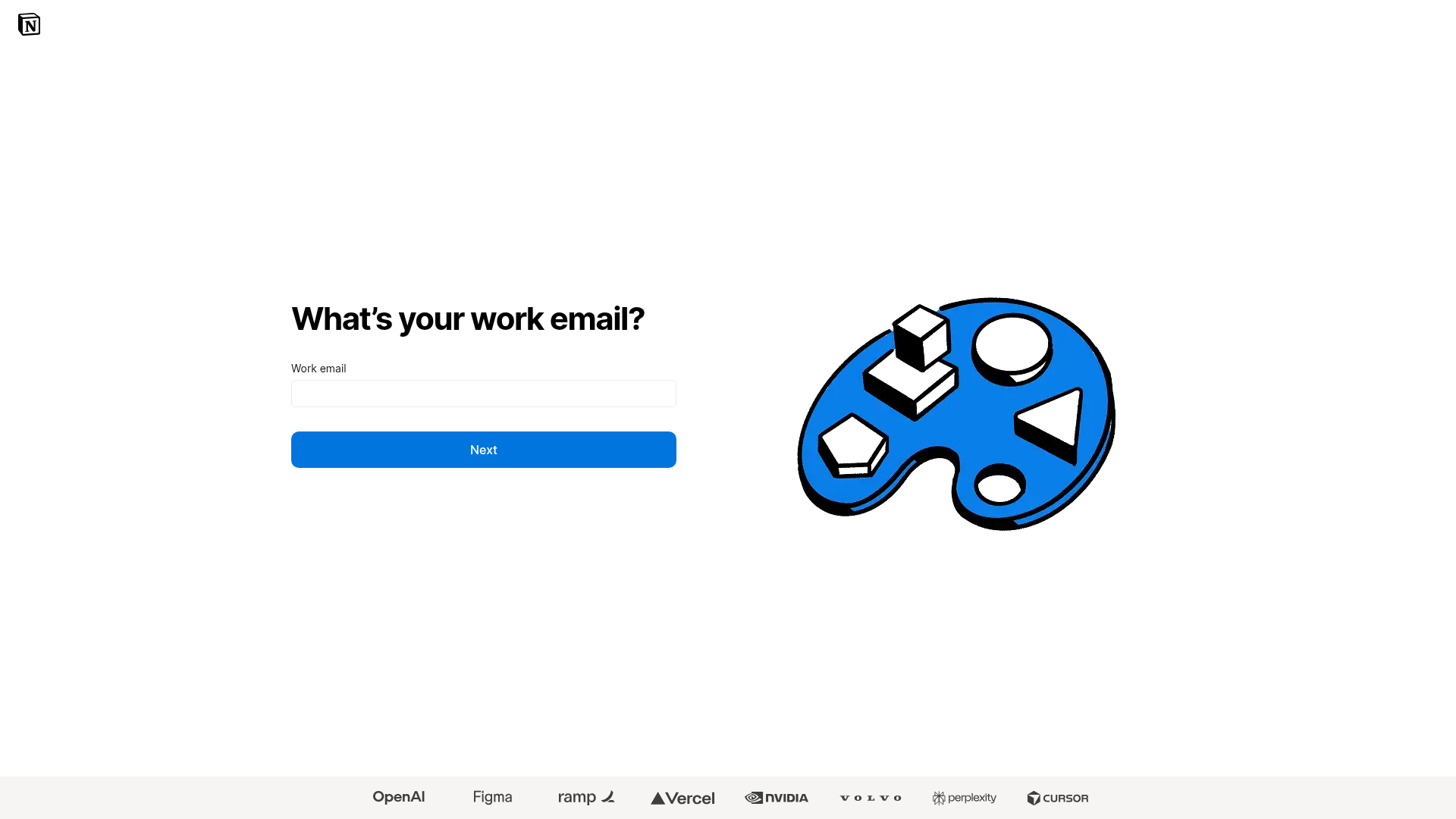
The first screen of Notion's contact-sales journey is unusually focused. It asks for a work email, offers a Next button, and keeps the surrounding layout simple. Customer logos sit below the main interaction.
What works: there is very little ambiguity about the immediate task. The visitor is not confronted with a full qualification questionnaire before taking the first step.
What to borrow: if you use a multi-step form, make each step easy to understand. Group related questions, preserve answers when people go back, and avoid asking the same thing twice.
What to watch: this screenshot shows the first step only. It does not prove the whole journey is short or that an email-first approach converts better. A less familiar SaaS company may also need more explanation of the demo's value before asking for an address.
What makes a great SaaS demo page?
A great SaaS demo page connects a specific buyer problem to a useful product experience, with a proportionate form and a clear next step. Its job is not to get everyone onto a calendar. Its job is to help suitable buyers move forward with enough context for a productive conversation.
Explain what the buyer will see
Replace a vague invitation to explore the platform with a concrete agenda. A reporting tool could show how to connect a data source, build a recurring report and share it with a client. That gives someone a reason to spend time with you.
Be clear about the format and commitment
Say whether this is a recorded walkthrough, an interactive tour, a discovery call or a tailored live demo. Include the expected length when you can. A buyer should not need to submit a form to discover which kind of experience you mean.
Ask questions that improve the next action
Keep a field if it changes qualification, routing or preparation. Remove it if nobody uses the answer. A question about the buyer's main use case may be more useful than a mandatory phone number that sits untouched in the CRM.
Put relevant proof near the decision
A recognisable customer logo can help, but a specific case study may answer a more useful question: does this work for a team like mine? Match the proof to the audience and link to its source. Do not turn a customer's product result into a claim about your demo-page conversion rate.
Make the form dependable on a phone
Use visible labels, helpful validation, sensible keyboard types and controls that are easy to tap. Preserve completed answers if a submission fails. A persuasive page is not much use when its calendar or country selector prevents someone from finishing.
Make the handoff match the promise
If the button promises a booking, give the buyer a way to book. If a representative needs to review the request first, say so. The thank-you page, notification and sales response should all describe the same next step.
What should you ask on a SaaS demo request form?
Start with contact information and the smallest amount of context needed to route the request. Add a question only when you can explain how its answer improves the buyer's experience or helps sales prepare.
- Work email: where to send the confirmation and continue the conversation.
- Name: how to address the buyer.
- Company or website: which organisation the request concerns, when that is not already clear.
- Main use case: what the buyer wants to evaluate.
- Team size, region or another routing detail: only where it affects eligibility, ownership or the relevant demonstration.
That is a starting point, not a universal field limit. An enterprise security product may need different preparation from a self-service scheduling tool. Use conditional form logic to ask relevant follow-up questions instead of showing every possible question to everyone.
For example, an integration question can appear after a visitor names a tool they want to connect. A detailed procurement question can wait until that topic is relevant. Qualification should make the next conversation better, not make the first interaction feel like an exam.
What could stronger demo-page copy look like?
Here is an illustrative example for a reporting SaaS company. It is suggested copy, not a quotation from any of the companies above.
See how to build your weekly client report without starting from scratch.
In a 25-minute walkthrough, we will show how to connect a data source, create a reusable report and share it with a client. Tell us which tools you use so we can focus on a relevant workflow.
CTA: Request my reporting demo.
Next-step note: Our team will email you within one business day to arrange a suitable time.
The useful part is not the exact wording. It is the agreement the copy creates: a defined task, a clear time commitment, a reason for the question and an honest description of what happens next. Change the response promise to match your actual service.
How should you measure demo-page performance?
Track the journey from a relevant page visit to an attended, useful meeting. Submission volume on its own can reward a page that generates lots of requests your team cannot help.
- Form-start rate: how often a page visit leads to meaningful form interaction.
- Completion rate: completed attempts divided by started attempts, using a consistent time window.
- Booking rate: how many eligible requests result in a scheduled meeting.
- Attendance rate: whether booked buyers actually join.
- Sales acceptance and opportunity quality: whether the conversations match the business you can serve.
Segment results by traffic source and device. A visitor from a product-comparison page may be ready for a call, while someone reading an introductory article may prefer a tour. Compare like with like when you test a new headline or remove a field. There is no defensible conversion benchmark for these four examples without access to their underlying data.
What about people who leave the form unfinished?
First, check whether the page or form gave them a reason to stop. A phone-number requirement, an unclear question or a loading error needs a different fix from a visitor who was simply interrupted.
Where partial-fill capture is enabled and appropriate, saved answers can help you understand where people drop off. If someone has supplied contact details, any follow-up still needs a suitable purpose and the required privacy and consent safeguards. An unfinished form is not the same as a submitted demo request.
For a practical breakdown, read our guides to partial form capture and lead abandonment. Fixing a confusing form is often more valuable than adding another recovery message.
A practical SaaS demo-page checklist
- The headline names a buyer problem or useful outcome.
- The page explains what the demonstration covers.
- The visitor knows the format and expected time commitment.
- Every required field changes a real decision or helps preparation.
- Relevant proof appears where the visitor is deciding whether to continue.
- The button describes the actual next action.
- The confirmation explains who responds and when.
- Validation, scheduling and error recovery work on mobile.
- Existing customers can find support without entering the sales queue.
- Reporting follows the journey through to attended, useful meetings.
Frequently asked questions
What is a SaaS demo page?
A SaaS demo page helps buyers evaluate a software product or request a demonstration. It can offer a live meeting, a recorded walkthrough, an interactive tour, or a clear choice between those formats.
Which SaaS companies have good demo-page examples?
Ramp is worth studying for live and self-guided choices, Gong for outcome-led messaging, Asana for clear follow-up expectations, and Notion for a focused email-first step. These are design examples, not a ranking based on private conversion data.
How many fields should a demo request form have?
Use the fewest fields that let you identify the request, assess relevant fit and provide the right next step. There is no universal number. Remove required questions that do not affect routing, qualification or meeting preparation.
Should every SaaS company offer an ungated demo?
No. A self-guided tour can help buyers understand a product before speaking to sales, but complex or sensitive workflows may need a tailored conversation. Choose the format around what buyers need to evaluate, and make the level of commitment clear.
What is the difference between a demo page and a contact-sales page?
A demo page promises a product demonstration or a way to explore the software. A contact-sales page can also handle pricing, procurement and other commercial questions. Either can work, provided the page describes the experience accurately.
Does a shorter demo form always convert better?
No. Removing unnecessary questions can reduce effort, but removing useful context can weaken routing and sales preparation. Evaluate changes using completed requests, qualified bookings and attended meetings, not form length alone.
Build a better demo journey, not just a better-looking page
You do not need to copy a large SaaS company's entire page. Borrow the choice that solves a real problem: Ramp's different ways to explore, Gong's outcome-led framing, Asana's next-step clarity or Notion's focused first screen.
Then make sure the form and handoff deliver on that promise. HuperForms supports conditional questions, answer-based scoring, routing and partial-fill capture so teams can build a more relevant path from interest to the next action. Build your demo qualification form, or start with our guide to building a lead qualification form sales can use.
Primary sources
Reviewed and screenshotted on 17 November 2026. Follow the links to see each company's current experience.